Brand Kit
Every cut of the Degen mark, the grounds each one is cleared for, and the colour and type underneath. Take the files you need and copy the rest straight off the page.
Logo
Two questions and nothing else. Which shape — decided by the room there is for it — and which ink, decided by what is behind it. The mark is never redrawn to suit either: it is one of these four drawings in one of these six inks.




Colors
Three that carry the identity — the ink, the ground it is drawn on, and the dark already inside the mark — and five secondaries under them, none of which is a tint of another. Click any tile to copy it.
Primary
Secondary
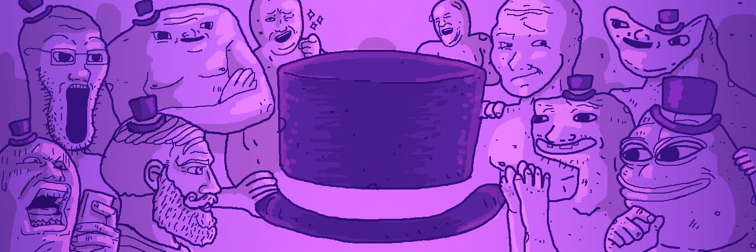
Banners
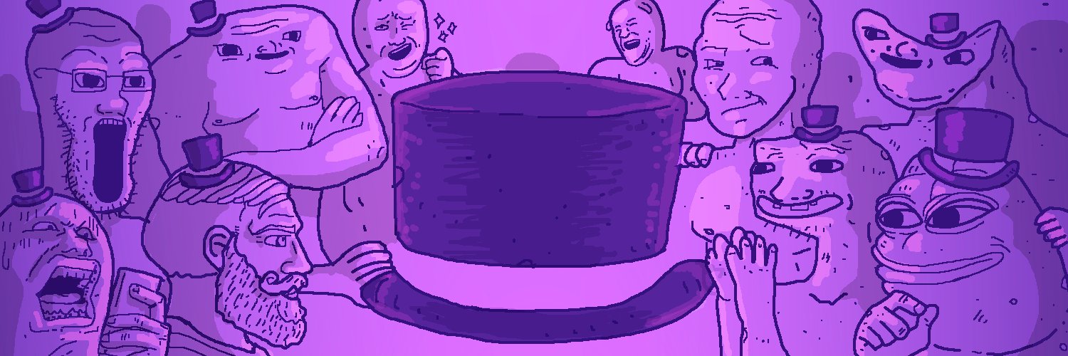
The X header as it currently runs. It is a drawing rather than a mark, so it ships flat and at size: crop it to fit a platform, but do not redraw it or lift pieces out of it to use somewhere else.


Typeface
Rubik carries everything that is read, in seven weights with an italic for each. Wall Bomber and Dirty Lizard are display hands — headlines, stickers, a word at a time — and neither is a face to set a sentence in.
Weight · 300 to 900
Italic · the same seven
Character set · hover to preview
Display · Wall Bomber
The marker hand. Narrow, upright and written rather than drawn, so it holds a line of several words without turning into texture — the closest of the two to something you could set a whole headline in.
Everything it has
Display · Dirty Lizard
The wider tag: rounder, heavier and far less even. It is a one-word face — a sticker, a stamp, a name — and it loses legibility fast at anything under about 40px.
Everything it has
Wall Bomber and Dirty Lizard are not Google Fonts — both files come from wherever they were licensed.